
A case study by Eleanor Jack.
All quotes attributed to Lesley Kersey, director at HortPlus.
–––––––
A brand refresh and website copywriting by Ed, has resulted in a new identity and online presence for HortPlus that appeals to clients and aligns with the company’s growth plans.
Founded in 1998 in Hawke’s Bay, HortPlus provides growers across New Zealand with horticultural decision support and management tools for higher profitability, better control, and more peace of mind.
The brand refresh resulted in a new identity for HortPlus that appealed to clients and aligned with the company’s growth plans.
HortPlus’ brand and website had not been refreshed for fifteen years when they were introduced to Stefan from Ed in 2018.
They engaged Stefan to redevelop their logo and tag-line, with an accompanying graphic icon, font family, colour specifications, and indicative image gallery.
HortPlus also contracted Stefan to write new key messages, SEO keyword research, and copy for a new website that Hortplus designed and built.
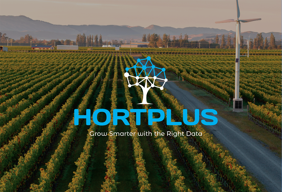
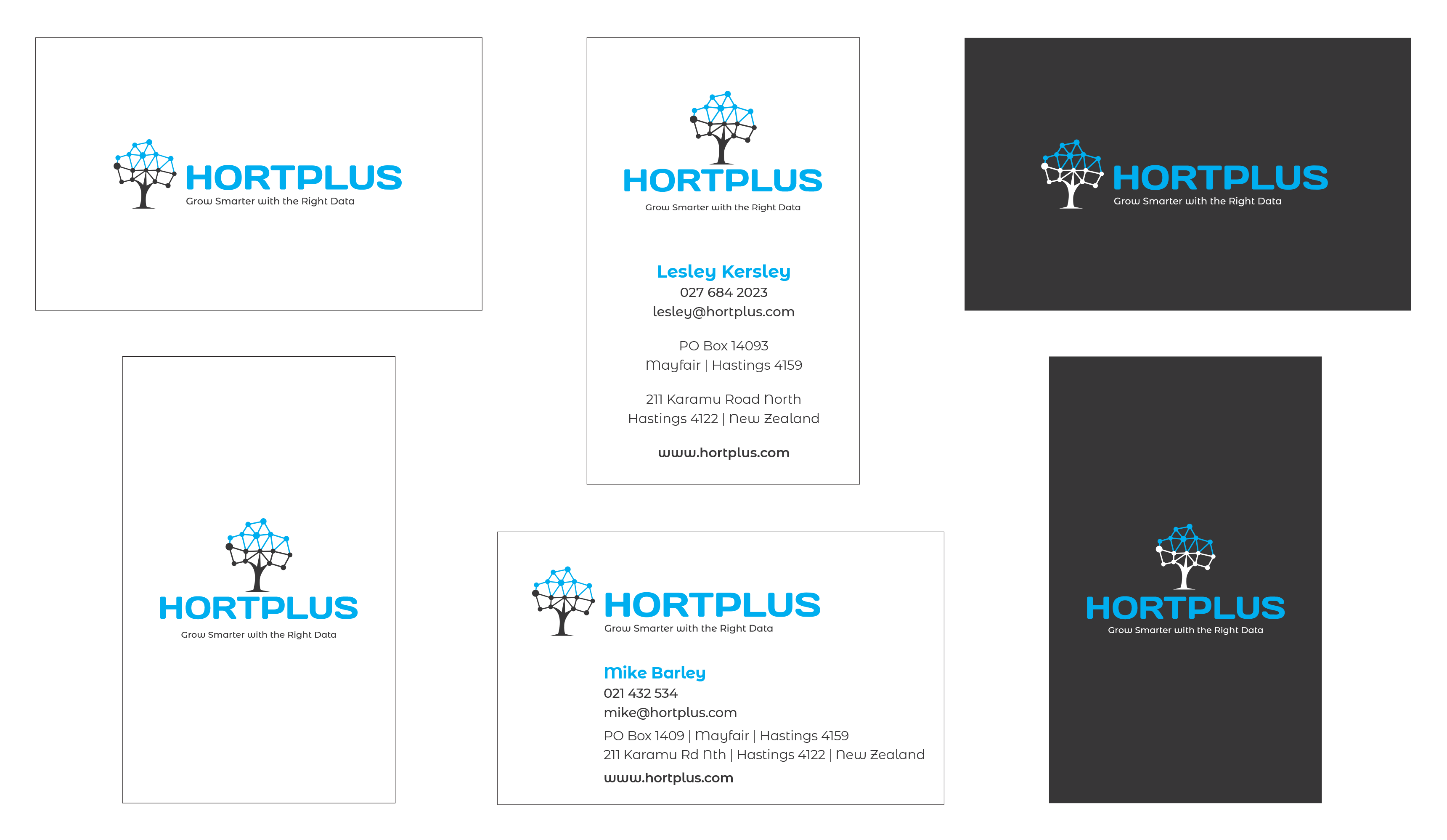
Ed redeveloped the HortPlus logo and tag-line with digital-tree icon, font family, colour specs and brand guidelines document.
“We heard about Stefan and Ed from James at Webfox who recommended him. We had an initial meeting and it was clear he’d be a good fit.”
–––––––
Distilling Complex Information Into Digestible Website Copy
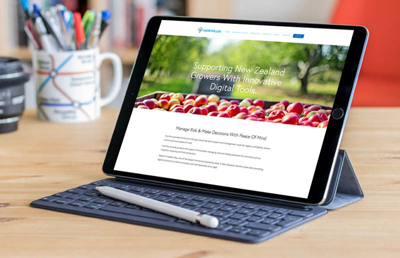
The copywriting brief was to convert the old website’s technical language to succinct, pithy and persuasive content that would grab the attention of the target audiences.
Stefan started with an audit of HortPlus’ written materials before meeting with the team to gather answers to a series of key questions.
The understanding gleaned from this process enabled the creation of everything from the brand story, mantra and key messages, to the draft sitemap, and SEO website copywriting.
Ed converted existing technical language into succinct, pithy and persuasive content to grab the target audiences’ attention.
“Stefan was able to get the right words out of us and articulate what we wanted. He was really good at making the language succinct and simple to understand. The new website shows key information instantly, and it’s easy to find more if you need it.”
–––––––
A New Brand To Drive Growth
Stefan created several logo concepts for HortPlus, each with a different font, graphic, colour combination and tag-line, to give the HortPlus team options to consider.
They chose a simple design in charcoal and blue; an icon of a digital tree with graph-like bars and points representing branches and the tag line, ‘Growing Smarter with the Right Data.’
A simple design in charcoal and blue; an icon of a digital tree with graph-like bars and points representing branches.
“Stefan wasn’t limited at all, he took our suggestions on board, listened to what we wanted, and didn’t railroad us into anything. He then gave us a range of colours, combinations and styling to choose from.”
–––––––
Wide-Reaching Impact
With both copy and design, Stefan was able to marry the two historically distinct worlds of technology and horticulture in a way that would speak to the target audience.
The HortPlus team also found that talking with Stefan about their company’s identity and offering had a bigger strategic impact than anticipated.
And, they received excellent feedback from stakeholders after introducing the new logo and website with their Christmas 2018 message.
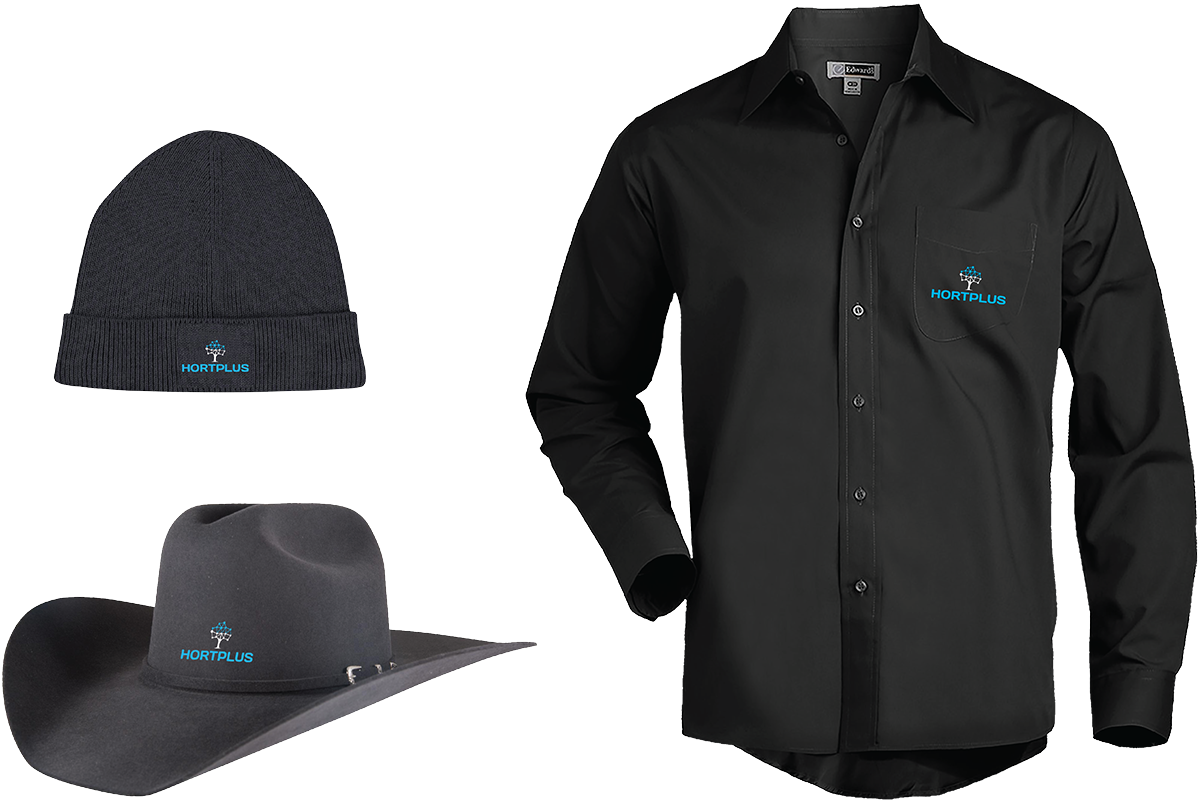
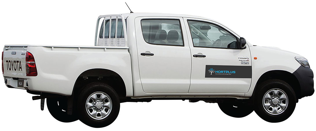
HortPlus have had business cards made, and new shirts, office signage, and flags for field days are next on the agenda.
“Everyone loves the new logo and brand. It symbolises what we do with the tree reflecting the two sides of the business. People are impressed and think it’s really smart. We’re thrilled with the reaction we’ve had.”
–––––––
A Fuss-Free, Efficient & Friendly Approach
Ed prides itself on being easy to work with, timely, and making the process simple for clients. This approach gelled with the HortPlus team who appreciated the efficient and clear communication style, and didn’t have time for the non-essentials.
The HortPlus team are proud of their new look and motivated to carry it through all their collateral. Using the brand guidelines produced by Stefan they have had business cards made, and new shirts, office signage, and flags for field days are next on the agenda.
The HortPlus team are proud of their new look and motivated to carry it through all their collateral.
“Ed’s process made us think quite deeply about what we wanted to be. With the new logo and brand we’re now looking forward and planning more – our new logo and brand is reflective of who we are and is right where we want to be.”
–––––––
Ed for Brand, Marketing & Communications
If your business needs the services of a brand, marketing and communications expert, contact Stefan from Empire Design on stefan@empiredesign.co.nz or 027 285 3800. Or, connect with Ed and Stefan on Twitter, Facebook, Instagram or LinkedIn.
–––––––
Stefan Olsen @ Ed
027 285 3800
brand@ed.net.nz
–––––––